|
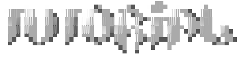
It's that time again! It's time for...
zeroVision's ansi font tutorial!
I got some good feedback on my first picture tutorial so I thought I'd try another, this time I decided to tackle my old nemesis: FONTS!
Fire up pablodraw and winamp, load some music and turn your brain off. I try to not overthink my fonts, treat them like shapes and it'll turn out ok.
First decide what you want your font to say, I will choose Pharcyde for the sake of this tutorial. 8 letters.
Here goes nothing! The 10 steps to font ownage.
1. Starting off
Start off with some rough spacing, you have 80 columns and 8 letters, if you make some letters bigger than 10 columns, you'll have to skimp on others so try to keep it uniform.
P H A R C Y D E
2. Outline
With your spacing guide, start the outline. draw right over it and try not exceed the given width because you'll be in trouble at the end.
3. Folding Up
I tried to draw this as thin as posssible to show you the true shape of each letter. We will distort this even further and flesh it out. If you have problemswith step 2 go to graffiti.org get a pen and paper and practice drawing some shapes you like until you can make funky letters.
One thing I think looks cool on fonts is 'folding' or a quick reversal in direction. For example.
simple line: Folded up: Back down: once more: again:
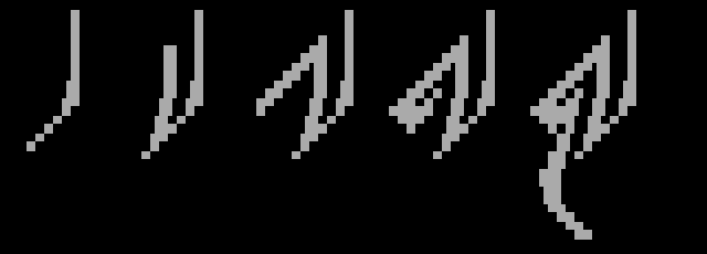
Overkill?:
 You can do this practically anywhere. Not only does it fill space but it looks cool and gives interest to an otherwise boring area. You can do this practically anywhere. Not only does it fill space but it looks cool and gives interest to an otherwise boring area.
Plus it can connect letters, act as a base or foundation for your font and anchor the whole thing to a background.
4a. More Width and Interconnect letters
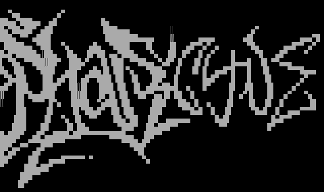
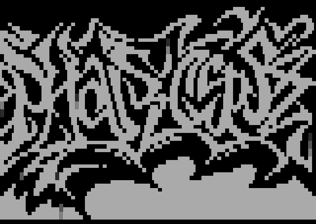
go back over your original lines and give them more width, Interconnect each letter as needed because it's cool and hard to read, the more illegible the better. This is half of the progression, the PHAR is fleshed out. Notice the folding technique.
4b. Distortion
Here's the fleshed out funky folded font.
It's looking good but it needs more distortion! Notice: the orignal lines are still present, just getting hard to see.
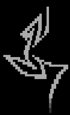
This is an enzo trick that i think is great.
Say you got an boring empty edge like this one. I'm not sure what to call it but it looks awesome.
1. dull 2. add some dots 3. connect

Again, more interest in an otherwise boring area. other tricks include:
Shadowing:
1. dull 2. divergent parallel shape 3. connected!

The Break:
1. dull 2. sever 3. realign 4. connect

Cracked:
1. dull 2. BROKEN!

Decayed:
1. dull 2. OH SNAP!

You get the point. It seems simple but can add a ton of interesting areas to an otherwise boring font.
This or THIS!!!
Back to the font:
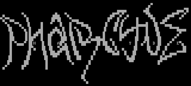
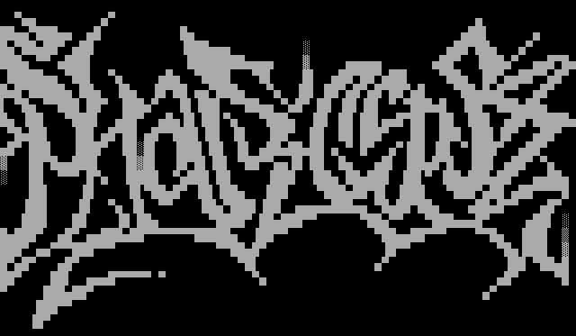
5. Distortion complete.
Not only is it looking awesome but the font is really filling out nicely. if done correctly all the edges can become the background and we won't have to worry about empty areas.
6. drop shadow.
mirror the bottom edge to give it some depth and make it appear to rise above the background. You can mirror the top too but my fonts usually sit right below a picture.
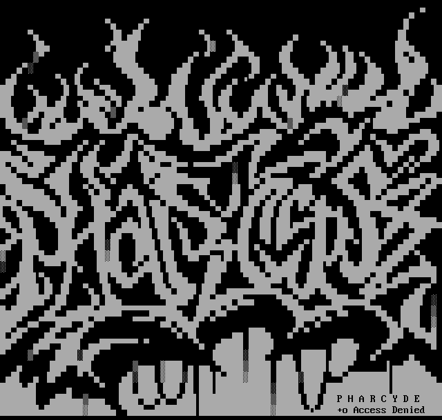
7. Background.
If you're lucky you've got a big fat font that fills the whole screen and you don't have to worry about a background if you don't, you gotta improvise. When all else fails I fall back on 3 things: fire, goo, and abstract swirly shit. Here i've added goo and fire for good measure!
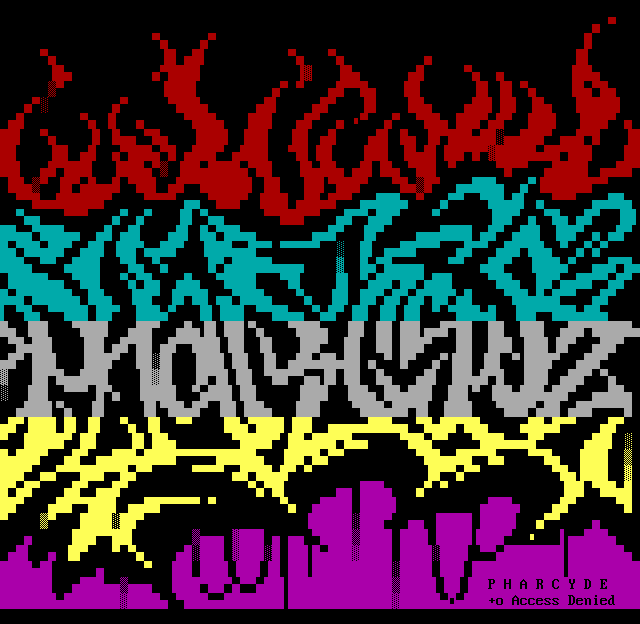
8. COLOR TIME!
lay down some base colors. to quickly fill in areas, pick a coloryou like, select stuff with your mouse and press F then A. Wow, it's like magic. So pick your favorite colors, pick two or three and lay them all down then get ready to try to blend them together.
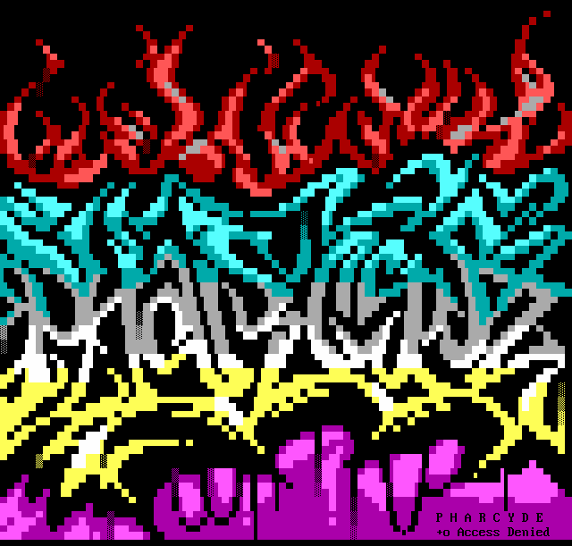
9. Add highlights.
this is as simple as drawing over your base colors with a brighter color. The more colors, the more depth, contrast is interesting but subtle fades are nice too. It all depends on what you're going for: smooth slick fonts or avg-headache-colors for max impact fonts. It's all style and substance, find what works for you. Notice, most of highlights are mono-
directional. they only sit on the top edge or bottom edge of a shape, giving depth and fooling your eyes. Ansi is one big optical illusion, blocks that make pictures... amazing.
This might be tricky until you find what colors you can use as background and foreground. Expect much trial and error until you get used to the colors. You'll get much better and faster at color switching, I promise it gets easier the more you do.
Almost done!
10. Blend colors together!
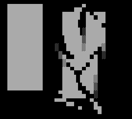
If you can make this bar: 
You can shade this picture. It's as easy as f1, f2, f3, f4.
As complex as this font is, it wasn't difficult. Time consuming? Yes. Especially to write all my steps out and think about how to explain a method to the madness. I'm convinced anyone can do this. Even if this style isn't to your liking you can apply these techniques to your own creation and make your own damn font masterpiece!
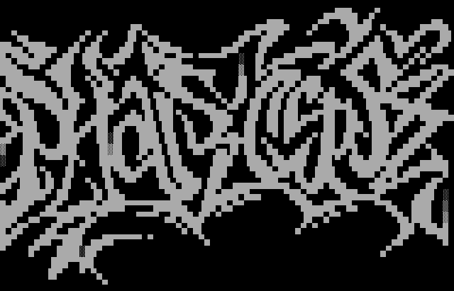
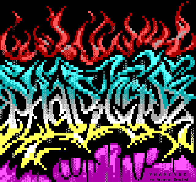
Final final version:
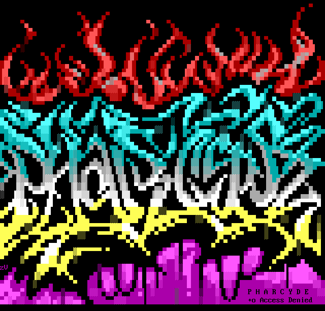
Don't forget your sig, and go call Pharcyde, cause Axisd is awesome.
This ANSI Font Tutorial was brought to you by Zerovision of Blocktronics.
|