|
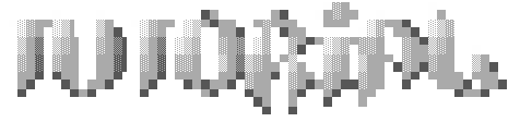
Greyscale Tutorial #1 aka 'Make a thing look shitty' tutorial, by Newt.
Download the original tutorial in .ANS format and .GIF snapshot (zipped):  nt-how2.zip nt-how2.zip
Tutorial time! Wheee... This one is for doing greyscale thingies. Greyscale is really cool to work with cuz of the immense amounts of different shading schemes you can use to trick the viewers eye. With three colours, you can end up with a mess of like.. 25 shades or something. It's really weird... Anyways. Here it is step by step.
|
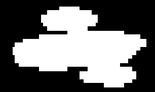
First you make your shape. Make it look Cool and stuff... randomly jabbing your F1 - F4 keys (TheDraw/ACiDDraw/PabloDraw) is not a good idea.
|
|
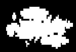
Now, add some shit that makes it look all fucked up. Like spikes and holes and shit. Play around with the blocks to get these. It's just a matter of repeatedly jabbing keys to get a combo you like.
|
|
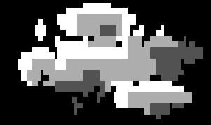
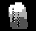
Now, place your colours. Don't worry if it looks all shitty. There's two things that matter with an individual shape.. that is, shading and outline. If your outline is cool, it's just a matter of shading.
|
|
Play with the shapes of the colours inside the outline to get shapes you like. Duh..
Don't get too creative yet. It's best to have smooth lines to mold later.
Note: your piece should look like a divider bar on steroids.
|
|
Now, phatify those shapes inside the outline. Just like step (something up above here)..
|
|
Ack. This is a bad piece to illustrate this point. But it's a good tip I picked up from HAL-HOW2.ANS (thanks again Halaster!). Add a toony type border thing. Here..
|
That type of thing ----->
|
|
|
|
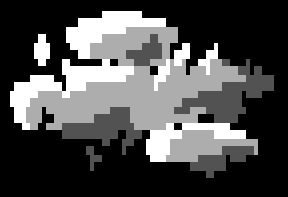
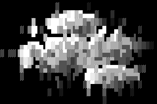
Do some basic shading. Go nutz.
This frame shows systematic-colour shading..

|
|
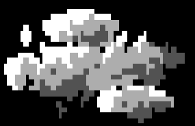
Now, do some same-colour shading.
|
|
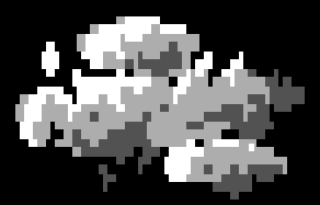
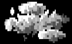
This is the part that makes everything REALLY fucked up. It's called Pnakotic shading. Check this out...

|
Take your basic colour shades..
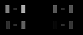
Wow! They're equal!
|
So, it's just a matter of substitution.
|
|
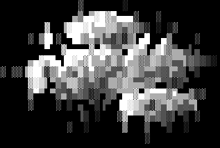
< < < You can also play around with things to get interesting effects. Check this out (i use it a lot)...
|
|
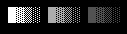
Ok. Finishing touches... This is mainly converting  blocks to the more smooth shaded counterpart ( blocks to the more smooth shaded counterpart ( ).. See the difference: ).. See the difference:
|
line >
|

|
< no line
|
In addition, flipping the Pnakotic's can create a blurry effect:

|
* only works with dark shades
|
|
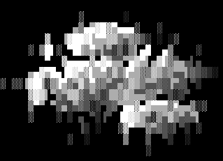
Anyways! that's about it. You too can make unidentifiable pieces of crap. Oh, one last thing... you have to say that the piece means something, although it really dosen't. So, the above is a font for "poo!" (misfit/trip's board) and you let your audience sort through the carnage.
Have fun, stay mellow... and keep drawin'!
Written on 01/02/1996 by Nootropic/Apathy.
|