nootropic - shading ascii
using the upper/lower case design thing
here's a neat little tutorial that shows two things... first, shading an ascii. this is much different than just colouring it, or flipping some blocks, or what not.. i've seen many people attemping shading, but it's really just toon stuff, in essence. here's how you get that shaded effect.
in addition, i am covering the upper/lower case thing i have talked about in other tutorials. it's neat and all, so check it out. remember, the fate of the scene lies in your hands.
Step 1
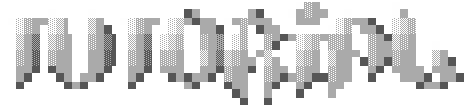
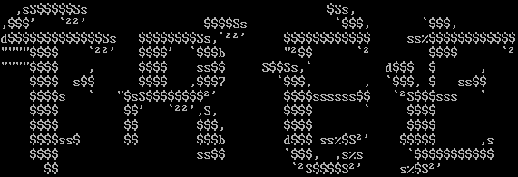
first i whipped up some neat looking holocaust-style letters. i had never tried it before, thought i might have a certain style with it. apparently i do not, and i don't plan on doing any more hO stuff :) let the master do it.
Step 2
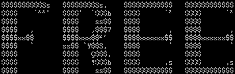
next i made a neat upper case looking "free"... it's the shittiest font possible methinks.. when doing the upper/lower case merge, it's a good idea to keep them similar to the basic dos font.
Step 3
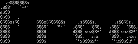
next, the lower case letters. essentially they are rather shitty... both upper and lower case fonts tend to look real shitty. now we merge em:
Step 4
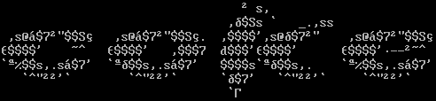
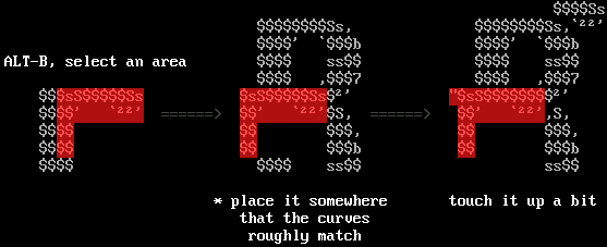
each letter is a combination of the lower case letters and the upper case letters.. all i'd do is take a piece of one letter and overlap it, occasionally using "U" (under in aciddraw) to put it under the upper case font... here's how:
Step 5
now i'm going to add blocks to enhance the artistic appeal. stuff like ¢ and ╝ smooth out the plain blocky $$ fills. in addition i'll correct any logical inconsistancies from the merge thing. ie, the shaded area.. that "d" should not be there to curve things back.
other blocks can be added as well (to the fill): &, %, _, _, G, #, _, Ñ, etc..
BE CREATIVE!
Step 6
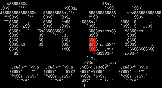
here it is with a bit of colour, and a few touchups with various characters. you'll notice that if you don't look really hard, you wouldn't normally see the oddball characters. it all tends to blend. now ya shade. this is the part that no one seems to get.
Step 7
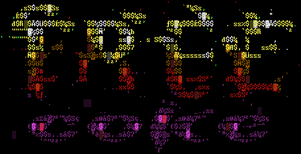
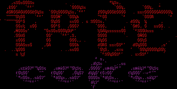
you'll notice that the pink F1 character has many many uses. it blends well with red, brown, and purple, and fits the colour coding of this anscii. when you're picking your colours, remember to be sensible! that's what most people tend to forget: make a colour scheme that looks good with just plain -letters-.. here:

etc... be creative, again :) anyways, that's all i have to say about that. look at the thing... pretty nift i think :) later.
-nootropic
|